In this graph, I analysed my personal rating by the year the song was released. In general, we can see that most of the spikes, and the biggest spikes are in the middle area, between the late 1970s and early 1980s. From this observation, we can likely make the conclusion that many of my highest rated songs fall into this era. From this we can see how the year a song was released may have an impact on how much I like it.
In the graph above, I compared my personal ratings to a genre they can be classified as. Each dot represents a song. However, some of them are overlapping each other so it can be a little confusing. Either way, it is clear that I have a higher number of liked songs in certain genres. For example, there are more liked post-punk songs than metal songs. So, we can conclude that genre does have some effect on how much I like a song.
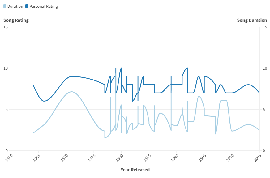
In the last graph, I compared the duration of the song, the year it was released, and my personal rating. It looks a little similar to the first graph, seeing the year and rating being compared. However, the addition of song duration makes it a little more interesting. When taking a first look, it does sort of appear that there is a pattern of some kind. Taking a closer look though, we can see there honestly isn't much of a correlation. I like songs of varying lengths, as short as one minute and as long as nine. Therefore, the conclusion that can be reached from this graph is that there is no connection between the length of a song and how much I like it.